Recipe Blog Design
A modern fusion of inspiring recipes and kitchen e-commerce.
Project Overview
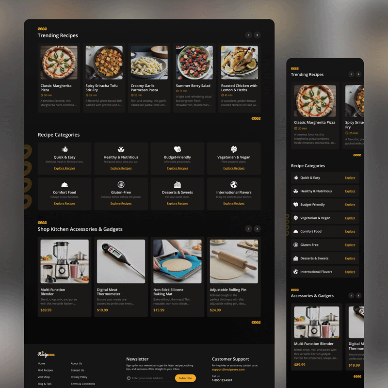
The challenge was to conceptualize a cooking blog that went beyond just recipes. The vision for this project was to create a platform that connects culinary inspiration with the tools needed to execute it, by seamlessly integrating native e-commerce. The goal was to design a landing page that is visually appealing, easy to navigate, and establishes a new direct revenue stream, enhancing the user experience by avoiding intrusive ads.
UX Research
1. Understanding the Culinary Ecosystem
We analyzed industry leaders to see what works and where we could stand out. We uncovered several key insights:
- Users value visual inspiration but get frustrated with overloaded interfaces.
- A clear disconnect exists: users get inspired by a recipe but must leave the site to find and purchase the necessary tools.
- Organization is crucial. Users want to be able to filter by meal type, preparation time, or budget.
2. Crafting Personas
To shape a design that would connect with real users, we developed three archetypes:

(34, Consultant)
✅ What She Does:
Looks for quick and healthy recipes to organize her weekly meals. She is practical and values her time.
💭 What Drives Her:
Efficiency. Finding what she needs quickly, with clear filters and intuitive navigation.
❌ What Bugs Her:
Cluttered websites, ad pop-ups, and having to scroll endlessly to find the ingredient list.

(28, Graphic Designer)
✅ What He Does:
Loves to experiment with complex recipes on weekends. For him, cooking is a creative hobby.
💭 What Drives Him:
Visual inspiration through high-quality photos and discovering tools that elevate his dishes.
❌ What Bugs Him:
Poor quality photos, poorly explained recipes, and not knowing which tools are best for the job.

(22, University Student)
✅ What She Does:
Cooks on a tight budget but enjoys trying new and fun things.
💭 What Drives Her:
Finding budget-friendly, easy-to-follow recipes that she can share with her friends.
❌ What Bugs Her:
Recipes that require expensive ingredients or tools she doesn’t have and can’t afford.
We are experts in UX/UI Design
Specialized service in the creation of digital products.
We design websites and apps.
Bringing the Vision to Life
1. Mapping the Journey
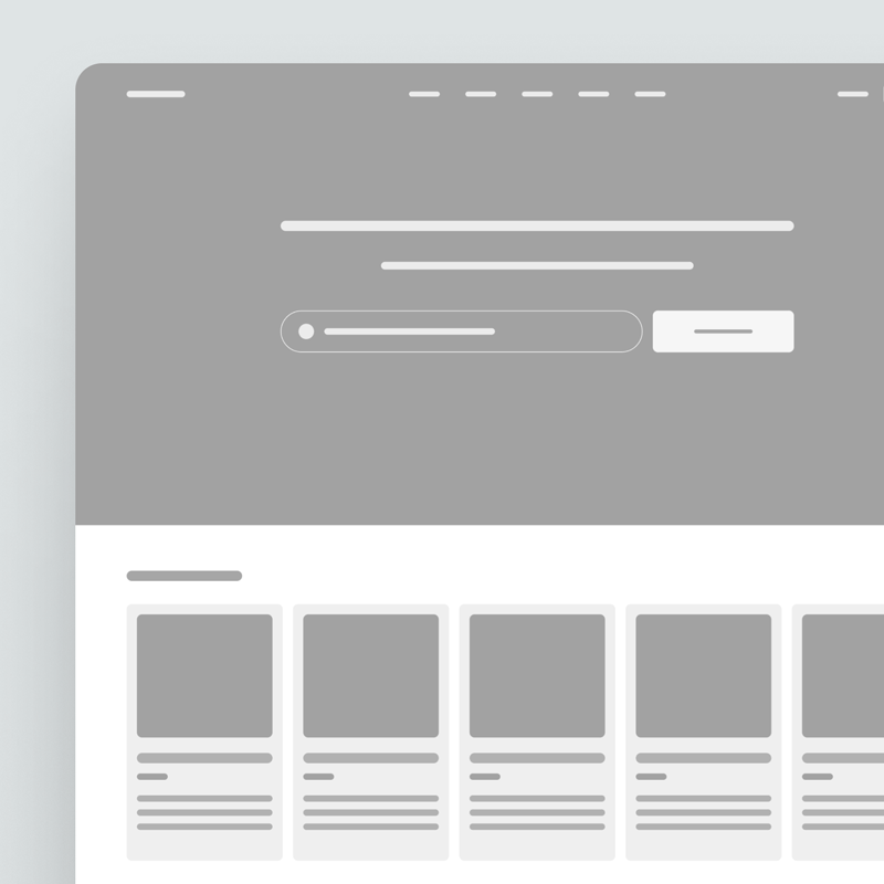
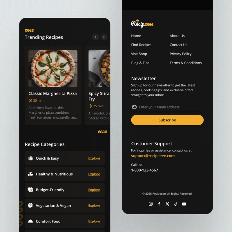
We defined a user flow that starts with inspiration and ends with a solution. The journey guides the user from recipe discovery («Trending Recipes») to category exploration, culminating in the ability to purchase recommended tools without leaving the platform. The wireframes were based on a clean, modular structure to ensure clarity.
2. Key Screens
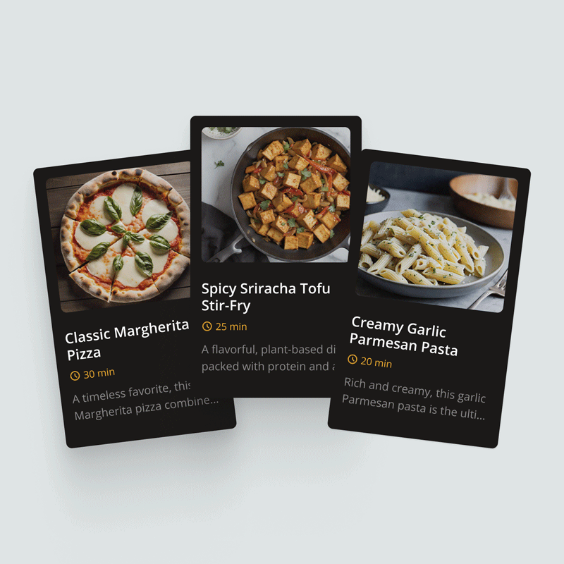
A high-impact visual section to capture the attention of users like David, offering immediate inspiration with the most popular recipes.
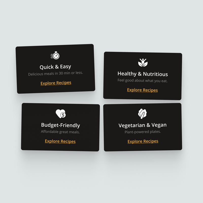
Designed for users like Anna and Sophie, this module with clear icons allows for direct and quick access to what they’re looking for: recipes by type, diet, or budget.
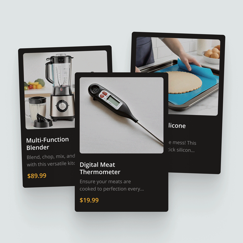
The native integration of e-commerce. Products are presented as a helpful solution, not an ad, connecting inspiration directly to action.
3. Design Details

Colors
A dark mode palette evokes sophistication and makes food photography pop. A warm yellow is used as an accent color to guide the user’s actions.
Font
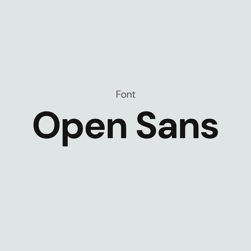
Choosing Open Sans as the sole font creates a clean and consistent user experience, ensuring maximum legibility from headlines to recipe details.
Responsive Design
A
Why work with us?
«More than 95% of our clients have achieved exceptional and tangible results, transforming their ideas into successful digital products.»
Why This Works for Business
This proposal sets the stage for:

The visual design and intuitive navigation are projected to increase session time by 40%.

A positive and memorable user experience builds trust and is designed to increase user retention by 20%.

The native e-commerce integration could increase product CTR by 15%, creating a new revenue stream.
Let’s Build Your Betting Platform
We’re pumped to design landing pages that turn bets into profits. Got an idea? Let’s chat—reach out today to get started!
Other works:
Let’s connect!
We can make your project a reality.
Write to us at our email and we will get in touch with you.
Our email:
Copyright © 2025 xensaciones.com
